After listening to valuable feedback from users like you and performing extensive research on the pain points and desires of our existing and potential users, we rebuilt our analytics dashboard from the ground up.
Analytics 2.0 maintains all of the features of Segmanta’s original analytics dashboard but it’s now easier-to-use, significantly faster and incorporates multitudes of new features making your survey analysis experience easier, better and more capable than ever before.
While the number of improvements and new features would be near impossible to list, here are some of the key highlights:
Significantly faster
Your data will now load much faster, resulting in a more instantaneous analytics experience, letting you slice and dice your data with even more ease.
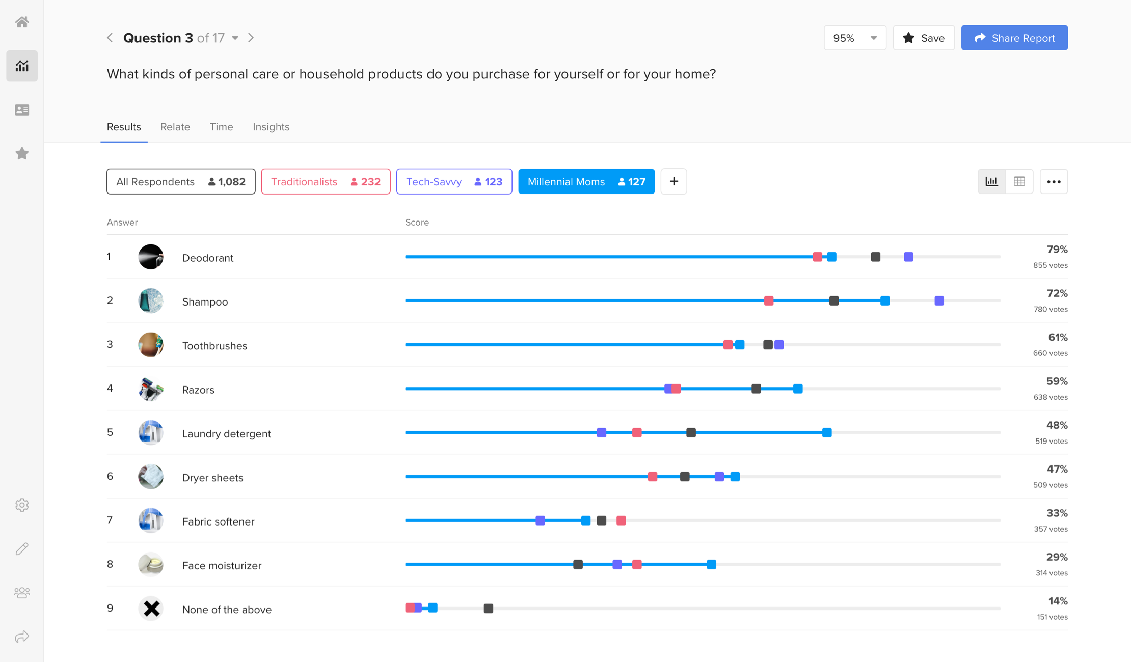
More flexible data segmentation
We’ve added a lot more flexibility to allow you to slice and dice your data however you need some of the new features include;
- Name and select colors for each of your segments
- Build segments using and or, or conjunctions
- Create filters based on page views
- Negate filters to easily compare contrasting groups
- Create more detailed segmentations by adding multiple filters using the same questions
- Auto-create segments from survey quotas
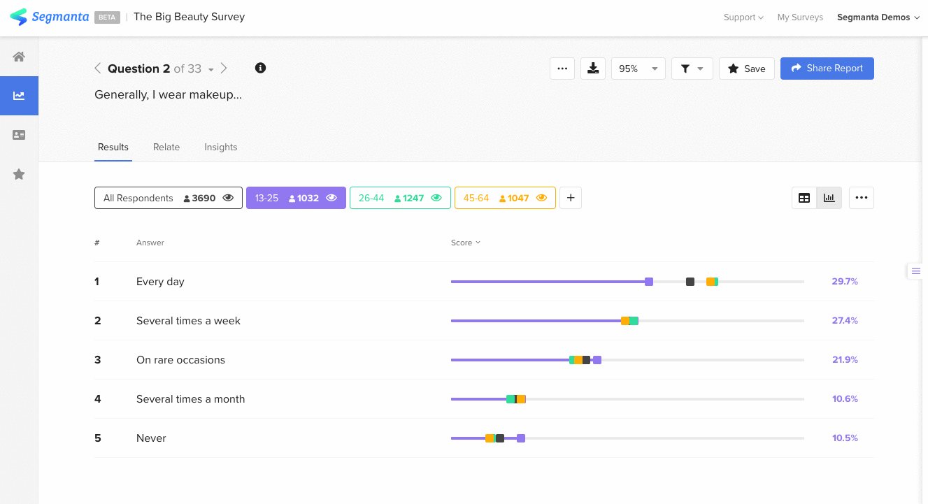
View your data in a table format
In addition to the visual charts and graphs you know and love, all of your survey results are now available in table view.
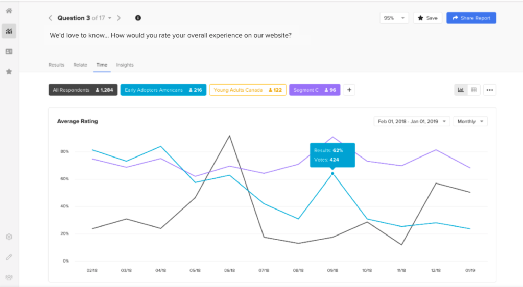
Track and analyze trends and changes over time
View changes in rating, opinion and NPS questions over time or select a specific time period to zoom in on to focus your time-based analysis.
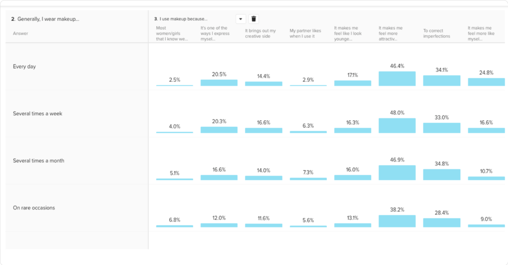
Build an unlimited Relate Table
You can now build a Relate Table with unlimited questions and almost every question type.
Immediately understand open ended response sentiment
Quickly and easily analyze your open ended survey responses using word cloud visualizations and sentiment analysis. Using powerful machine learning Segmanta Sentiment Analysis (Available for Professional and Enterprise accounts) assigns a sentiment – Positive, Neutral or Negative to each of your open ended survey responses.
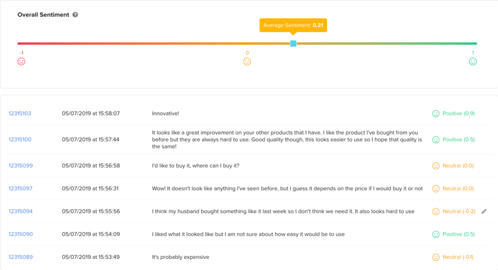
The assigned sentiment, which is supported in 11 languages, allows you to immediately understand the individual and average sentiment of your survey responses.
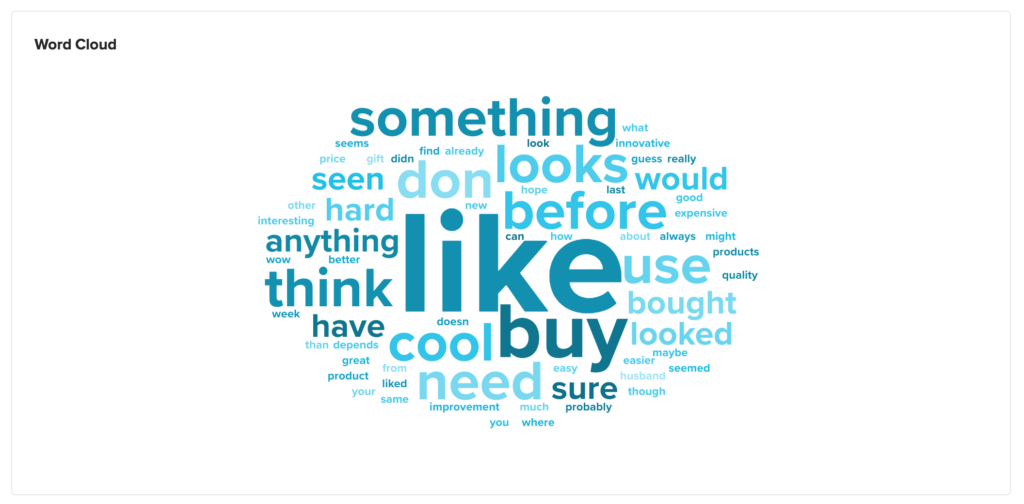
Automate open ended question analysis with visualized word frequency
You can now also visualize the frequency at which words appear in your open ended responses using Word Cloud. Word Cloud analyzes your open ended responses and visually presents frequently used words to give you immediate insights on your open ended responses. More frequently used words will appear larger while less frequent words
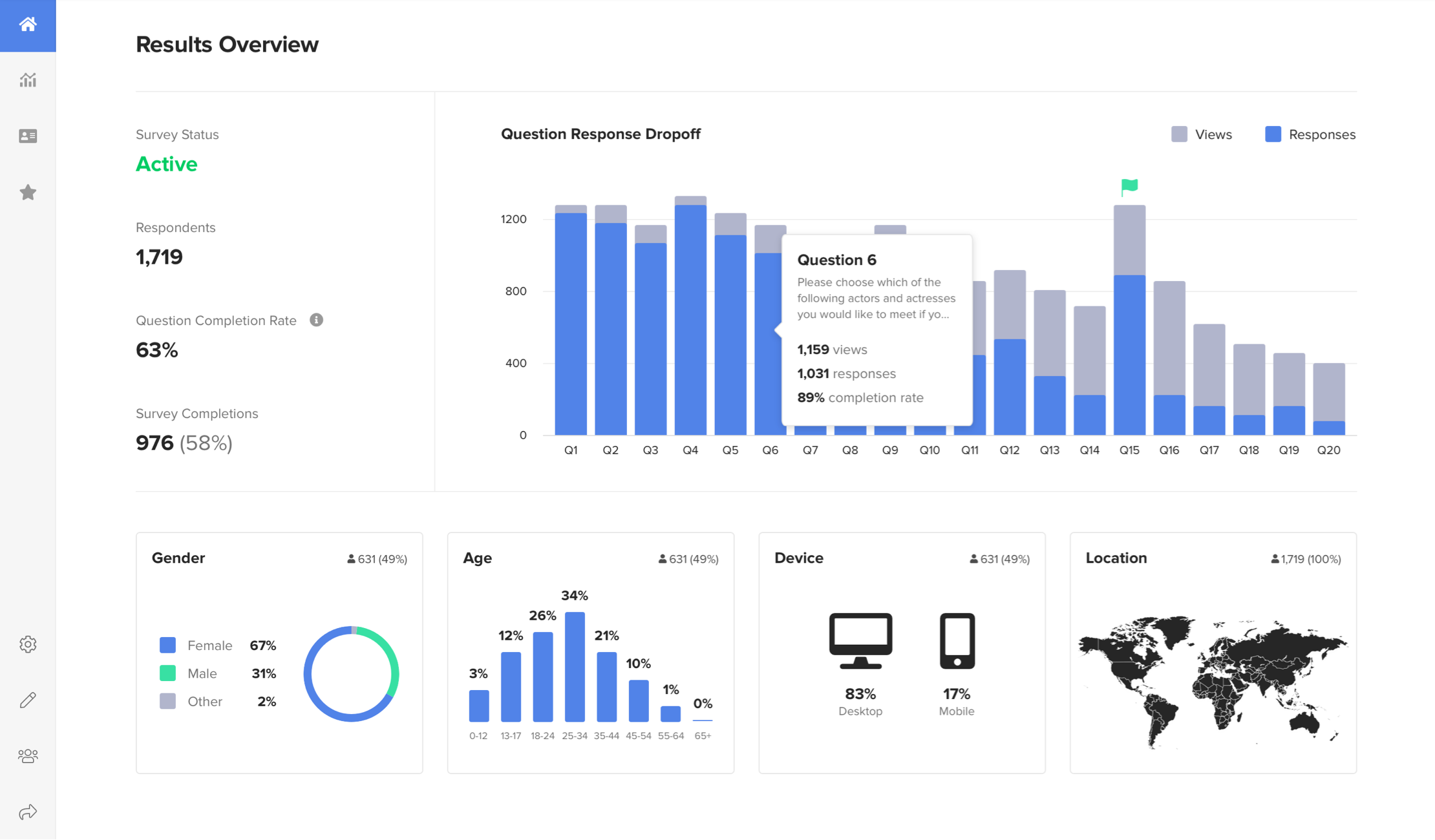
Immediately understand your survey’s experience index
Get a quick overview of your survey’s page views versus page submissions to understand where respondents are dropping off and take action to optimize your survey experience.
Try it yourself
You can live demo the new analytics now by visiting the dashboard of our State of Millennials Surveys. We are continuing to work at full speed to roll out new features and continued improvements. Have some feedback for us? Looking for a feature you don’t see? Let us know!


